Timeline
13 Weeks
Role
UX Design
Team
1 UX Designer
Tools
Figma
Axure
Framer
Platform
Website
Status
Concept
Contribution
UX Audit
Research
Visual Design
Usability Testing
Prototyping


Project Overview
Bonita India sells home utility products but with a poor user experience and outdated visual design. This project focused on revamping its design language and addressing issues in its outdated information architecture.
BonitaIndia is an Indian retail platform for home utility products, hindered by a cluttered user experience and outdated visual design.
My initial impression
Complex Navigation
Too many navigation bars made it hard to know where to look or venture.
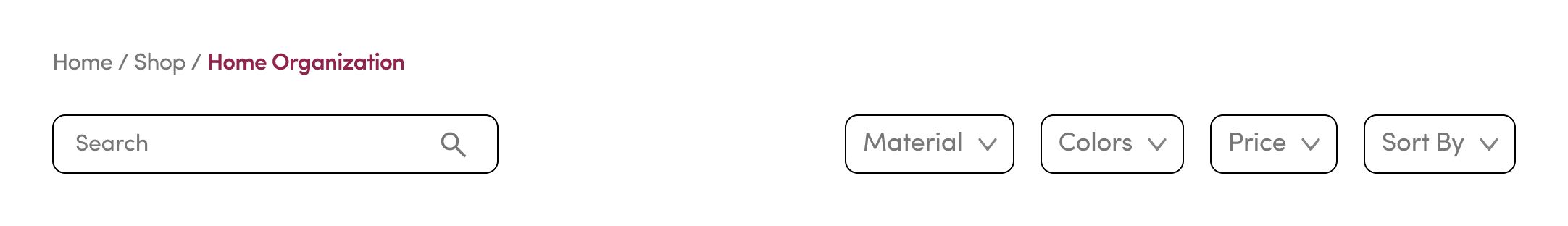
Lack of Search & Filter
Users couldn’t search or filter to find what they needed.
Redundant Authentication
Duplicate login options caused confusion about their purpose.
Poor Product Discovery
No way to find bestsellers or spot items on sale.
A quick usability testing among 5 participants!
4/5
found it difficult to navigate
0/5
were able to make it to the checkout step
3/5
found product information complex
5/5
weren't satisfied with the experience
Task 1
You're looking to buy a product that meets your needs. Explore the website as you normally would to find one that matches your preferences.
Task 2
You’ve found a product that interests you. Explore the page as you normally would before deciding whether to buy.
“It asked for color selection, but there was no preview”
“Some of the information on the menu is confusing”
“Since there are no images, I am a little confused”
“Why is there no search bar”
“Add to cart button is not really visible”
“Description is way too lengthy and so difficult to read at a glance”
“How do I know whether the product is good without reviews?”
Problem Statement
How might we streamline the experience to improve clarity, trust and conversion?
Bonita India’s site has confusing navigation, unclear product details, and an unstructured layout, resulting in user frustration and drop-offs.
Sneak Peak!

What began as a competitive analysis quickly revealed a pattern!
Top retail brands lead users through a seamless shopping funnel.
Awareness
Interest
Decision
Action
FREE SHIPPING
ADVERTISEMENTS
RECOMMENDATION
BENCHMARKS
FEATURES
ALTERNATIVES
REVIEWS & RATING
SHARP VISUALS
+5
CHECKING OUT
Engaging product storytelling
Trust-building content
Frictionless checkout flow
Attention-grabbing promos
And that pattern was missing! To validate this further,
I conducted a UX audit across 874 web links, and uncovered more insights.
Ineffective Navigation Structure
The website lacked a clear navigational hierarchy, making navigation difficult.
Ambiguous Labels
Labeling across the site was unclear and inconsistent, leading to misinterpretation.
Inconsistent Design Language
Inconsistent use of typography, buttons, and icons disrupted visual continuity.
Lack of Clean Visuals
Cluttered layout and poor spacing led to a visually overwhelming interface.
Drawing from both the competitive analysis and UX audit, I distilled three key user goals that shaped the design direction.
Clarity in Product Info.
Users needed to scan and understand product information at a glance, without digging through dense text or scattered specifications.
Effortless Navigation
Users wanted a clear, intuitive structure that made it easy to browse, switch categories, and locate relevant content with minimal effort.
Streamlined Journey
From discovery to checkout, the focus was on ease, confidence, and encouraging users to come back.
A little bit of brainstorming & user testing!
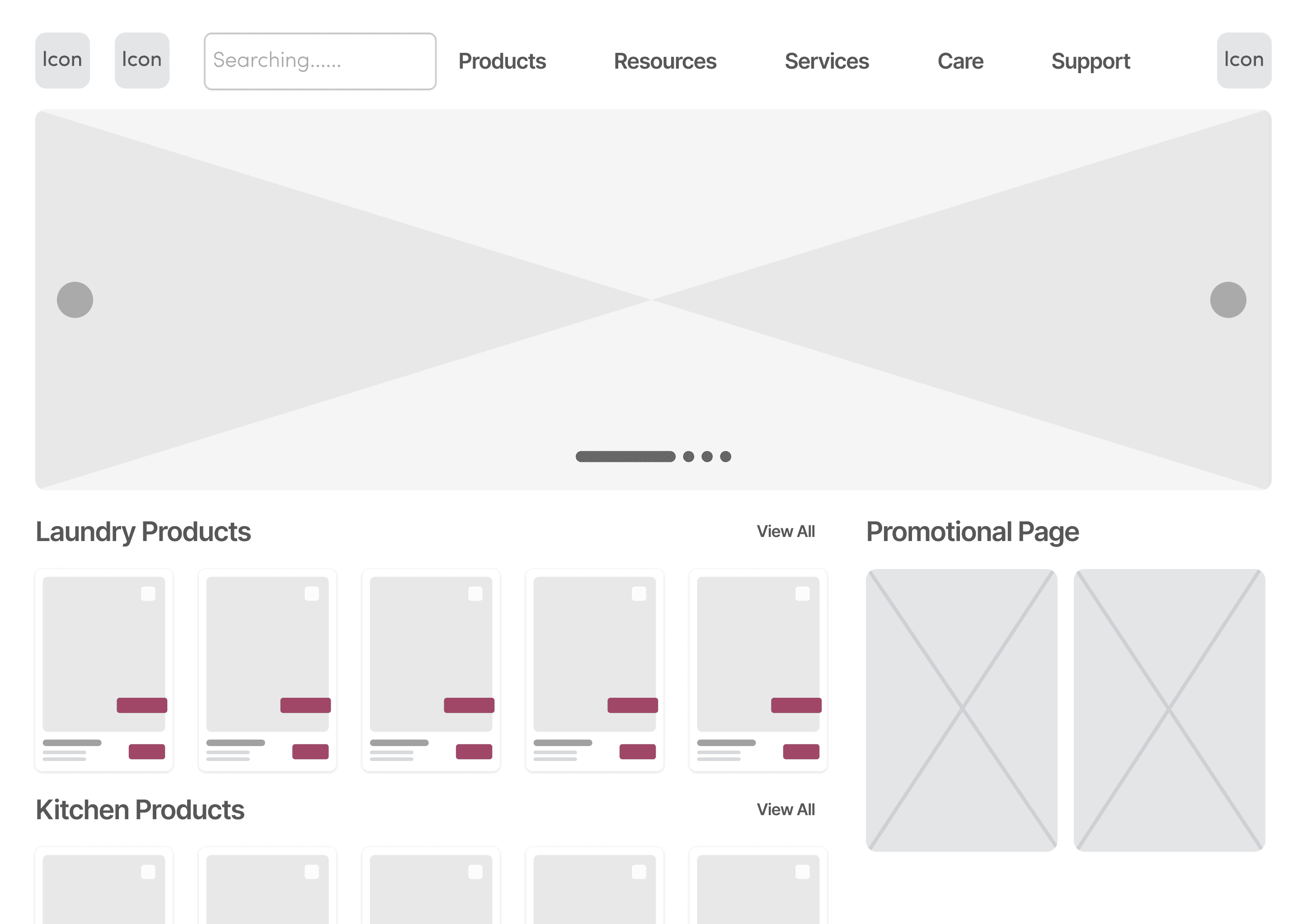
Iteration 1
Users experienced high cognitive load from a cluttered interface and unclear hierarchy, making it hard to focus or compare offerings from the homepage.
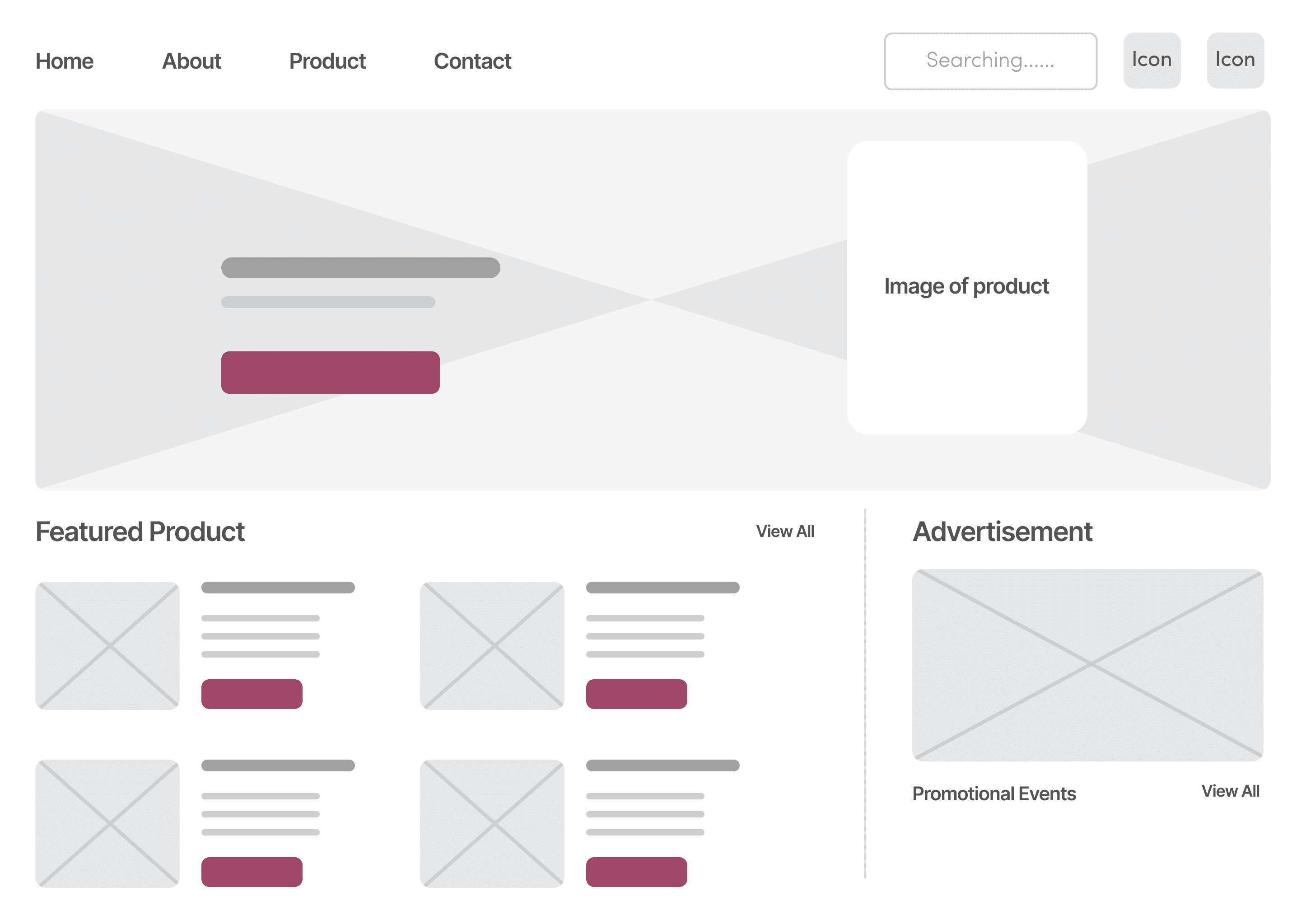
Iteration 2
Despite reduced clutter, users still struggled to focus between ‘Featured Product’ and ‘Promotional Events,’ unsure where to look first.
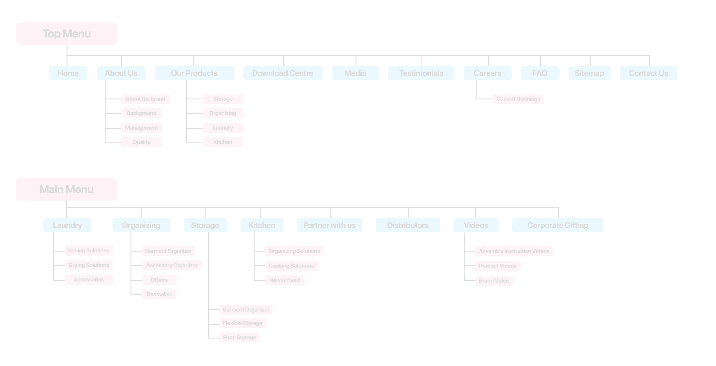
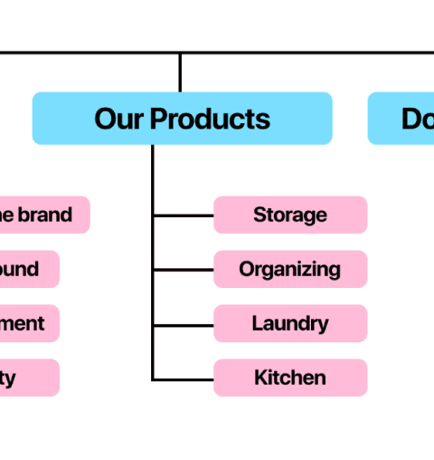
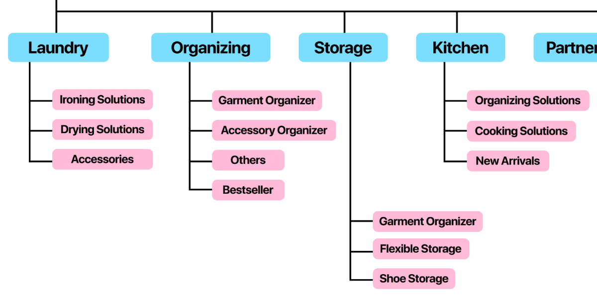
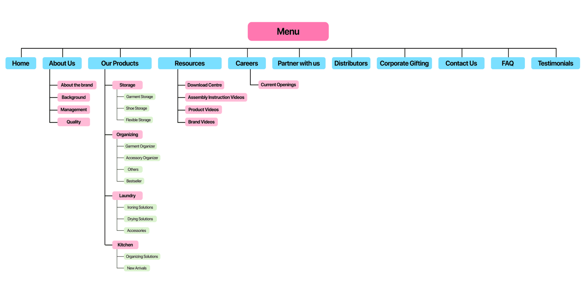
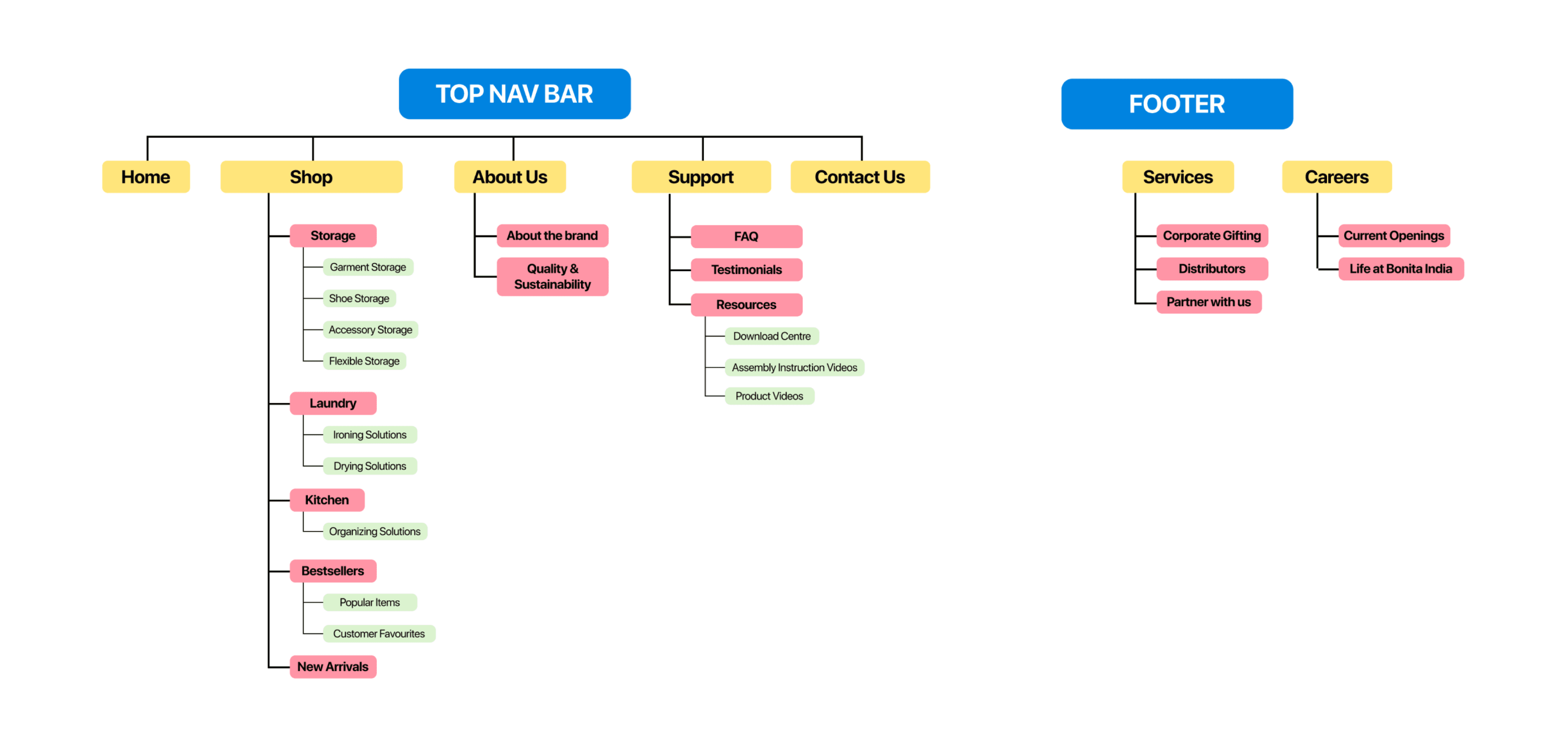
This prompted a restructuring of the sitemap using the
card-sorting method to clarify content organization.

The existing sitemap had a lot of information that was not relevant for the primary user.
The card sorting exercise revealed that most users preferred engaging with specific product categories, shaping the hierarchy of content accordingly.


Primary Focus
Secondary Focus
Each iteration aimed to simplify the information architecture and reduce cognitive load, making the structure more intuitive and scannable.
Iteration 1
Iteration 2

With multiple iterations, I finalized the version below, as it best balanced user priorities, simplified navigation, and minimized cognitive load.
Putting it all together!
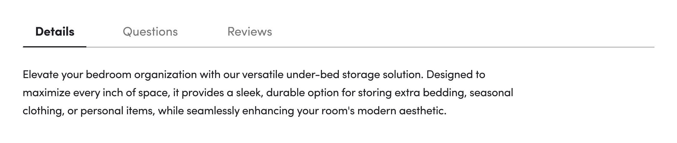
Users can also know what they are buying!
Now users can find exactly what they need!
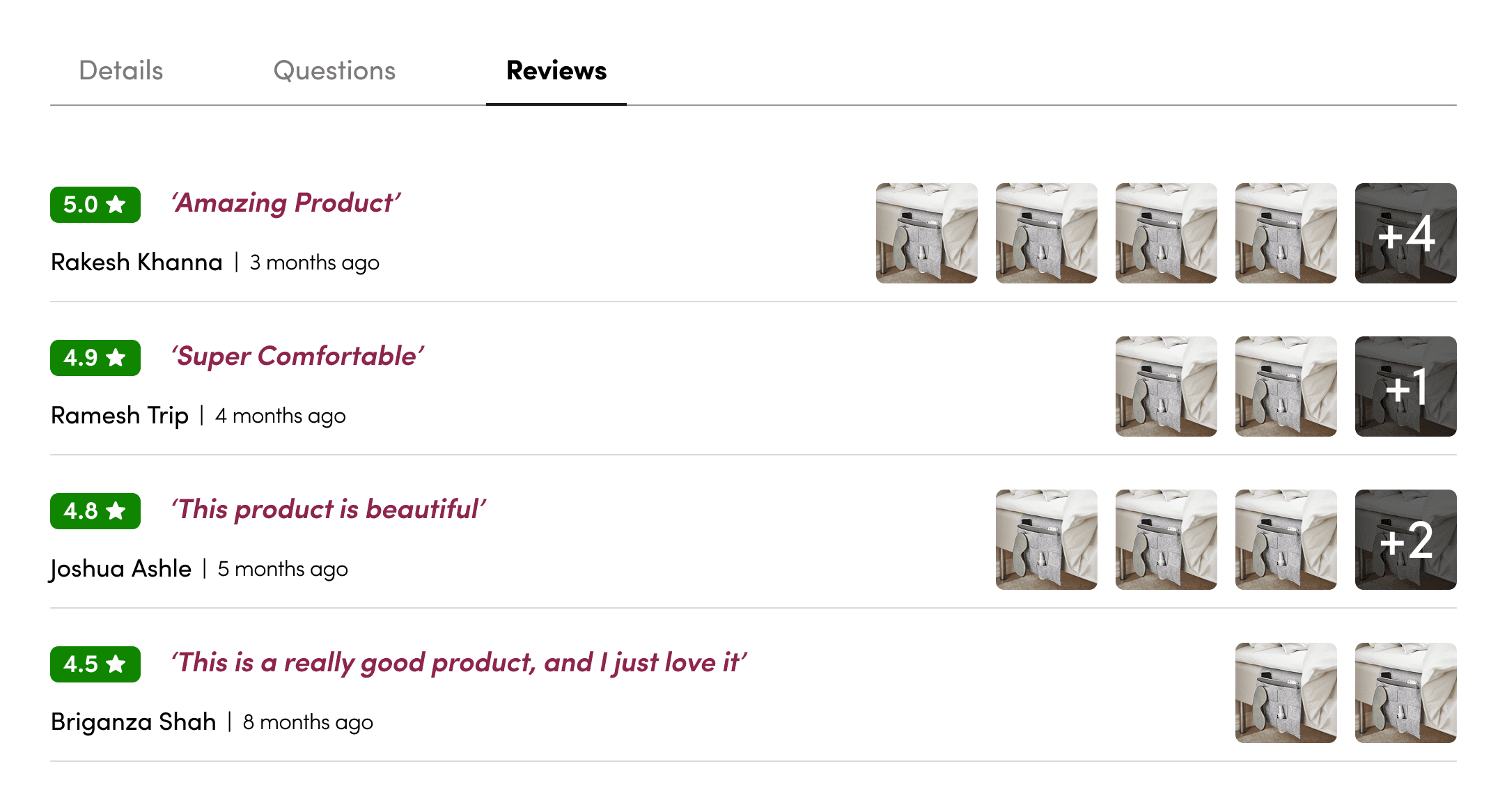
And they can also see what other think about the product!
Simplified Product Listing Page
Clean Product Detail Page
Impact
The redesign addressed key usability challenges for first-time shoppers.
By simplifying the sitemap and restructuring content through user-tested card sorting, it enhances wayfinding and reduces friction during navigation. This creates a more intuitive experience, helping users quickly find what they need and move confidently toward checkout.
Higher Task Completion
40% increase in timely task completion was observed after the redesign, due to improved content hierarchy and simplified navigation patterns that aligned with user goals.
Lower Error Rate
Error rate dropped by 90%, as users encountered fewer dead-ends and misleading elements, resulting in smoother decision-making and reduced backtracking.